At Tenrec, we are always on the lookout for new developments that can improve user experience and engagement. Though we’re also keenly aware of the fact that many ideas that take hold don’t always put the user first. So, we asked our designer to provide some insight into the emerging trends in website design. This is what he found:
The defining UX/UI trend of 2020 and beyond is accessibility. Virtual Reality, asymmetrical layouts, and autoplay videos are certainly hot design trends that will continue to grow over the coming year, but through the lens of accessibility they are at best possibly annoying, at worst disorienting or physically and/or mentally painful.
I reviewed a number of 2020 design trend articles and saw many overlapping opinions. Let’s take a look at a few design trends that I love, some that enhance accessibility, and some that are just plain excessive.
Trend 1: Large Typography
From a design perspective it’s just plain beautiful. Large bold typefaces deliver powerful messages that won’t soon be forgotten. From an accessibility perspective it is wonderful, especially for visitors that are sight-impaired or color blind. One caveat is that this trend often comes paired with another, that being typographic overlay in asymmetrical layouts, which can sometimes cause color contrast compliance issues.
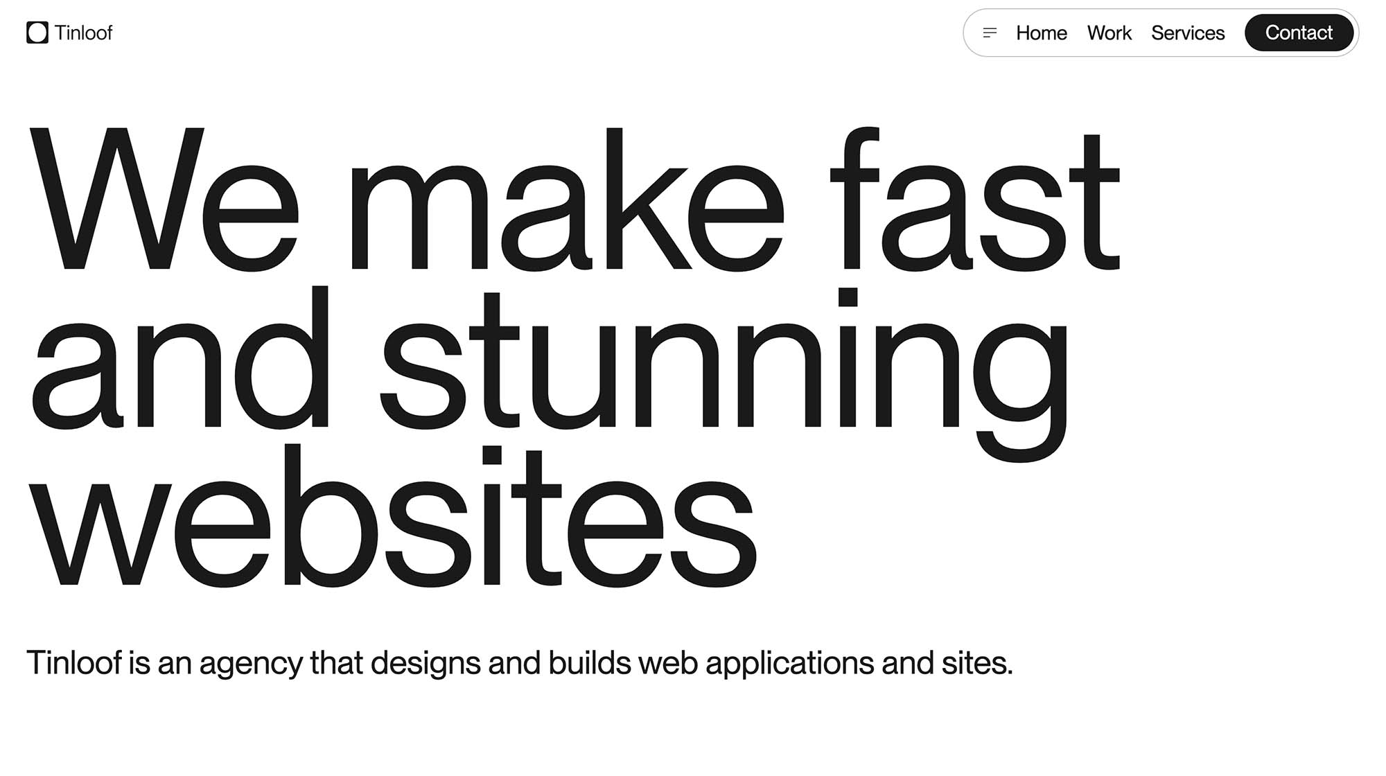
A website that employs large typography very well is tinloof.com/. Though it does feature some minimal animations and large photography the typography of the site is bold, beautiful and legible. Then, for a less well done example (one that goes to dizzying, overwhelming extremes) visit Burnish Creative. Here you’ll see thin, outlined fonts on top of moving images, excessive animations, and disorienting movements. Though these effects are eye candy for the well sighted they can cause physical and mental pain to diff-able (differently abled) visitors.
Trend 2: Minimalist Layouts
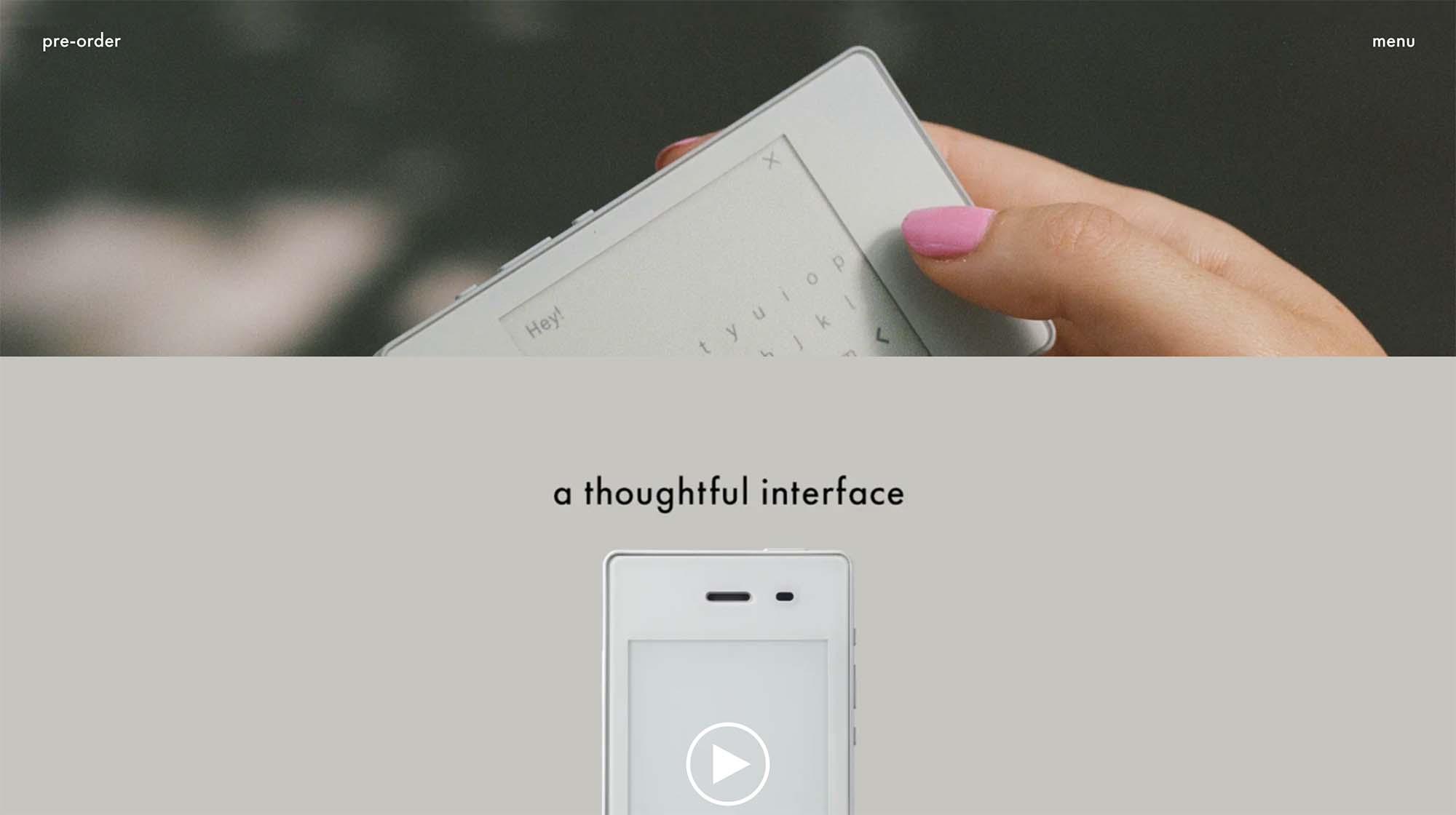
Similar to the Large typography trend, I am totally on-board with the minimalist open layout of sites like onpoint.com and thelightphone.com. From a stylistic standpoint this trend might not work for everyone, but with the right typeface to communicate the personality of your organization and minimal microinteractions and subtle scroll effects you can create a beautiful, sparse,and very accessible site.
One thing to consider to consider when designing a new, accessible website is how visitors using screen reader software like JAWS will navigate the site. Typically they will be tabbing or arrow key clicking through your site so it is paramount that your site’s elements are ordered logically in a linear fashion. This is somewhat of a developer’s tip, but it is good to think about during design as well. Screen reader users will traverse your website’s on-page elements like a list that is stepped through and read aloud to the visitor. There should be a very clear hierarchy of elements with the most important ones such as the navigation items at the beginning, then well organized, and named sections of content, and finally a footer with links to all top level pages of the site and a sitemap.
Trend 3: UX Copywriting
UX Copywriting has been a growing trend for the past few years. It is essentially a user-focused approach to delivering your message. Context is king and this trend recognizes that visitors consume the copy and the design of a website as a single entity. The UX Copywriting approach is a general “humanization” of written content; an effort to understand who your organization wants to reach and to create content that appeals to the context of your audience. As Moses Kim the UX writer and researcher of shakuro.com says, “UX copy of a website is a consistent message and an identifiable voice of the brand people are interacting with.”
Your content communicates the personality of your organization. From an accessibility perspective, if your content is poorly written and disorganized you may not be well received. This includes what is known as “microcopy” which is the small snippets of content such as button titles that should be humanized as well. With easily digestible and, dare I say it, entertaining language you will increase engagement with all your visitors, the abled, diff-abled and others.
Trend 4: Access, not Excess
Then there are the growing trends that should be used with caution or should have accessibility fallbacks. I will call these “trends of excess” as they are purely for the fully abled visitor. I am talking about Augmented Reality (AR), Virtual Reality (VR), 3D Graphics, and CPU heavy animations. There are a couple reasons to avoid these trends: One, in order for these trends to be made accessible they would need to allow a user to disable disorienting visuals or sounds, which would defeat the purpose of the element. And two, these trends are often prohibitive to those with slow internet access because they require so much processing power to function. Essentially they are to be enjoyed by those in the developed world only.
Average Global Internet Speeds from www.fastmetrics.com
Trend 5: Design to Comply
Not only is increasing accessibility the just thing to do, it is also becoming the legal thing to do. Data privacy laws like Europe’s GDPR and now California’s CCPA are creating legal precedence for data transparency. Hence the emergence of all of the cookie consent popups. Meanwhile accessibility compliance lawsuits are growing and the things that organizations are sued for are often very easily fixed by a few hours of development.
There are 1.5 billion diff-abled people in the world and they have been often overlooked in the design & architecture of the Web. The past was built on exclusion, but the future is inclusive and accessible. If we begin to ask ourselves if our tools, websites, and stores (digital or physical) are accessible first and then design these spaces accordingly, we will be that much closer to a diverse inclusive world that is open to all.