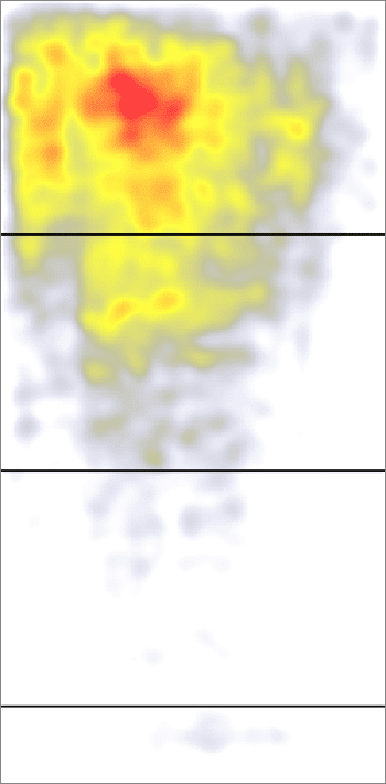
 The question boils down to this: Should you be concerned with what shows above the fold vs. below the fold on your website? The debate centers on whether or not the ‘fold’ (i.e. the bottom of the screen, ‘above the fold’ = what you can see of a website before you scroll down) matters anymore or whether website visitors are so conditioned to scroll/swiping down that the fold makes no difference.
The common sense argument is that the fold does matter to some degree but it (common sense) also tells us that as Web users have grown more sophisticated they have grown less bothered by scrolling. Web design has followed this logic and shifted to embracing the scroll. Leading design models have stopped trying to stuff everything into the pixel space above the fold and now use scrolling as integral to their user experience.
Indeed, even organizations building new websites or redesigning old ones have taken up the trend and have, more or less, stopped asking to get everything that they consider important on the first screen. This has been a huge relief for us and the designers with whom we work. We’re seeing a lot less horse trading around content and design elements that need to be visible on the first screen. This is especially true of mobile sites where the smaller resolutions dictate scrolling as a necessary interaction.
But Here’s the Bad News
While the fold may be slowly becoming less relevant it is still a major factor to consider when designing your site, more than I would have guessed in these times. The Nielsen Norman Group just posted their findings on the matter today and their conclusion is decisive.
“The average difference in how users treat info above vs. below the fold is 84%.”
– Norman Nielsen Group
This means that something above the fold will be viewed on average 84% more than something below the fold (off the first screen). 84%. That is a number that doesn’t indicate ambiguity. The NN Group used their own study and one by Google to come up with this number. The Google study was based on the ‘viewability’ of ads above and below the fold (i.e. could users have seen the test ad). The NN Group’s study focused on what users actually looked at through eye tracking and pegged the difference to be 102%.
Suffice it to say that the difference in terms of actual views between something above the fold and something below the fold is substantial. It might be less substantial than it was in the past but we’re a long ways away from being able to ignore the fold. In fact, we’ll probably never get there.
Now What?
The takeaway here is simple but nuanced. You should be concerned with the ‘fold’ and having your most compelling content visible on the first screen. But you should also acknowledge that users are more acclimated to scrolling and just because something is below the fold doesn’t mean it will not be seen at all.
As pointed out in the NN Group’s study, content above the fold should communicate effectively to the viewer that there is more to see/read/experience below the visual limit of the page. In other words, it is imperative that your design compel visitors to scroll down. Don’t plan on your website viewers doing this out of the kindness of their hearts. Entice them to do it.
There are different ways to do this enticing such as simple navigation links that jump them down the page, parallax scrolling effects, down arrows or “read more” links, and visual elements that indicate the page continues below. You can even go as far as using a metaphorical illustration to indicate the down-scroll.
The Fold as an Imperfect Science
You need look no further than the most recent screen resolution statistics on w3schools.com to appreciate the variation in where the ‘fold’ is for your viewing audience. There’s no way to control for the different resolutions. Some visitors to your site will see more or less of its pages (at least in terms of the vertical dimension) than others. This again emphasizes the nuance to deciding what content goes where on your page.
The first 100 pixels are more important than the next 100 and the second 100 pixels are more important than the next 100 and so on. It’s not a useful exercise to analyze your page’s vertical design on a pixel-by-pixel basis or to be rigid about where the fold is. Instead prioritize your content and make an effort to keep the most important content, whether that is copy, calls to action, images, videos or other, at the top or near the top of every page.
And the next time someone tells you that the fold in web design is “old school” and doesn’t matter anymore, remind him/her that we still read from the top down and that whether it’s a browser window, television screen, magazine cover or newspaper, all have a finite amount of space to work with and the most important stuff always comes first.
